Wall drawing
Why uneven boxes look better
An even grid is the layout you get when nobody made a decision. It is not wrong — a five-by-two grid of identical boxes is tidy, and on a long hallway wall it can be exactly right — but on a feature wall it tends to read as wallpaper: regular, repeating, and strangely flat. The eye finds nothing to settle on because every part of the wall is making the same claim on attention.
Varying the sizes fixes that by creating a hierarchy. One box becomes the subject and the rest support it. This is the same logic that governs panelled doors, sash windows and traditional wainscoting, none of which divide a surface into equal parts — and it is why a wall with a wide centre panel looks like joinery while an even grid looks like a calculator's output. Which, usually, it is.
The practical constraint is that uneven layouts are harder to work out by hand. With equal boxes you divide once. With different sizes you are solving for the space left over after the sizes and gaps you have chosen, and every change to one box moves every other number on the wall — which is precisely the arithmetic that makes people give up and default to an even grid. Editing the sizes above and watching the drawing and the cut list update is the whole point of this tool.
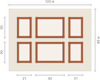
Three layouts that work
Sizes below are for a 120 by 90 inch wall with 12 inch margins and 6 inch gaps. The Distribute presets in the Columns panel seed the first two for any box count.
Wide centre
21 · 42 · 21
One dominant panel with matched narrow flanks. The safest way to make a three-box wall look composed, and the one to reach for behind a bed, a sofa or a fireplace, where the centre of the wall is already the centre of the room.
Emphasised ends
34 · 20 · 34
The inverse: heavier boxes at the outside, lighter in the middle. Useful when something sits in front of the centre of the wall — a tall headboard or a TV — and you want the visible trim weighted where it will still be seen.
Weighted base
rows 30 · 36
Equal columns, but the lower row taller than the upper. Borrowed from traditional panelling; it grounds the wall and reads as considered even when the column layout is a plain even grid.
How to lay out mixed-size boxes
- Measure to the smallest reading. Take the wall width at a few heights and the height at a few points, and plan to the smallest. Walls are rarely square, and a layout planned to the widest reading will not fit at the narrow end.
- Fix the margin and gap first. Decide the bare reveal around the outside and the spacing between boxes, and keep both constant. These are what hold a mixed layout together — vary the box sizes, not the spacing.
- Switch the Columns axis to Custom. Try the Center preset for a wide middle panel or Ends for heavier outer boxes, then edit individual widths. The drawing and the cut list follow every keystroke.
- Mirror around the centre. If the sizes read the same left to right, the layout will look deliberate almost regardless of the proportions you pick. Asymmetry can work, but it has to be committed to rather than arrived at.
- Check the fit, then price it. The planner says in inches when a layout overflows rather than quietly clipping it. Once it fits, the cost estimate turns the cut list into a board count at your own price per foot.
Different-size boxes work in every style here, not only picture frame. Wainscoting takes mixed panel widths the same way — see wainscoting — and for the uniform styles, batten spacing is the equivalent lever. For the miter math behind the lengths, see how it works.
Questions
- Can accent wall boxes be different sizes?
- Yes, and on most walls they should be. A grid of identical boxes reads as a spreadsheet; varying the sizes gives the wall a focal point and looks deliberate rather than defaulted. The usual moves are a wider centre panel with narrower flanks, a taller bottom row, or a pair of narrow boxes bracketing a wide one. This planner treats different sizes as the normal case rather than a special mode.
- What is a good ratio for a wide centre panel?
- Roughly 2:1 against the flanking boxes is a reliable starting point — on a 120 inch wall with 12 inch margins and 6 inch gaps, that is about 21, 42 and 21 inches. It is wide enough to read as intentional without looking like the outer boxes were an afterthought. The Center preset above seeds exactly this proportion for any column count, and you can then nudge individual sizes.
- Should the boxes be the same size top to bottom?
- Not necessarily. Making the lower row slightly taller than the upper one is a classic trick borrowed from panelled joinery: it visually weights the wall to the floor and stops the layout looking like it is sliding upward. Switch the Rows axis to Custom and give the bottom row an extra few inches. Keep the difference subtle — enough to feel, not enough to look like a mistake.
- How do I keep different-size boxes from looking random?
- Hold something constant. Keep the gap between boxes identical everywhere and keep the outer margin equal on both sides, then vary only the box sizes. Symmetry helps too: if the sizes mirror around the centre line, almost any combination reads as designed. Randomising both the sizes and the spacing is what makes a wall look unresolved.
- Do different-size boxes cost more?
- Not inherently — the cost follows the total linear feet and how the pieces pack onto boards, not how varied they are. A mixed layout with a few longer runs can actually pack into fewer boards than an even layout with many identical short pieces. Use the cost estimate to compare two layouts directly at your own price per foot.
- Why can other accent wall calculators not do this?
- Most solve a single equation: wall width, minus margins, minus gaps, divided by a box count. That returns one number, so every box is that number. Handling different sizes means carrying an explicit size per column and per row and solving the remaining space around them, which is how this planner is built — the even grid is the simple case of that, not the other way round.